Turning Trust Into a Health Habit
Snapshot
Client | A leading national health nonprofit serving millions of people managing a chronic condition.
Company | iCrossing
Focus | Behavior-change strategy for a national health network's member engagement model
Role | Experience Lead, Research
Team | 3 people across experience, business strategy, and content
Timeline | 12 months to MVP launch, plus continued expansion to grow and deepen the experience towards the long-term vision of a companion app
Impact | Targeting 500,000 verified members by year one, 2 million by 2030 (results pending launch)
The organization’s engagement model was reactive: a “grab and go” experience of static content and one-time visits, with little room for personalization or reaching people when they needed support.
Context
The client’s ask was vague: grow the network. Their first pitch was a Reddit-style forum.
Our research said otherwise. People who were newly diagnosed were motivated but overwhelmed, and didn’t want another forum to dig through. They wanted real expertise, delivered to them.
So instead of a resource people had to find, we built a companion that reaches them first. The goal wasn’t a place to visit. It was a habit to keep.
Approach
A companion for people managing a chronic health condition, delivered by SMS and email. We scoped it down from a full mobile app to launch faster and prove the model.
It sends proactive nudges timed to when someone is likely to act, with bite-sized education and optional peer connection built in.
We named it Stacey, after Stacey McGill from The Baby-Sitters Club, who lived with diabetes.
The name gave internal teams and stakeholders a way to personify the experience and set it apart from generically named “community hub” initiatives.
Challenge
The two biggest obstacles were organizational, not technical.
Content volume. A single 12-week cycle could need 65 to 85+ message units once you factor in routing, re-entry, and completion logic, all of it for the client to build and maintain. The organization wasn’t yet producing content at that pace or specificity, and stale, repetitive content was one of the biggest risks to retention.
Readiness. This was a new kind of initiative for a team used to shipping static content and one-time visits, and there was real hesitation about whether they could support something this dynamic at launch.
I addressed both by scoping the MVP around what existing content could support and running a readiness workshop to walk the team through what the initiative would require operationally, so expectations and preparation were aligned before launch.
Strategy
Here's what I prioritized:
Credibility was the foundation. Research showed people trusted the organization’s clinical expertise more than peer communities, so the companion made that expertise feel personal without watering it down.
A model grounded in behavioral science. The approach was built on Just-in-Time Adaptive Interventions, delivering the right nudge at the right moment instead of guessing at timing and tone.
A tone that flexes with the person. Copy stayed clear and practical by default and shifted warmer at moments of overwhelm, re-entry, or low engagement, based on what research showed people needed at each stage.
Content built for retention. Archetypes and pathways kept the experience offering value long after the welcome sequence.
Not every person living with this condition is ready to act. The strategy targeted the ones who were motivated, recently diagnosed or newly at-risk.
The experience was built around those who were ready for change, but unsure of where to start.
Ownership
As Experience Lead, I worked closely with a business strategist and content lead to bring the experience to life.
Built the experience architecture. Owned user flows, information architecture, and content structure across onboarding and the ongoing loop, working with the content lead on archetypes, pathways, and tone so content and design moved as one system.
Ran research solo. Designed and ran the survey and interview program with no dedicated research team.
Owned the client relationship. Presented findings and direction to stakeholders directly, keeping decisions moving and aligned.
Built an AI-powered workflow. Moved research synthesis, user flows, and IA structuring straight into testable prototypes, refined through stakeholder input and testing.
Led design and launch. Directed the visual designer and managed risk and quality through the final push to release.
Measurement
The experience hasn’t launched yet, so this is the plan for measuring success. The MVP isn’t about proving interest. It’s about proving behavior change.
Network growth. Verified membership growing from roughly 150,000 to 500,000 by the end of year one, on the way to 2 million by 2030.
Meaningful participation. People showing up weekly, coming back, and completing the full 12-week cycle, not just enrolling.
Behavior change. Whether people take the small actions we nudge toward, not just whether they open a message.
Results to come.
Success isn't a single visit. It's still being there in week twelve, and turning that trust into the next generation of advocates.
Reflection
The gap between finishing one phase and getting the next SOW approved can cost real time and momentum. Looking back, I’d advocate earlier for a lighter first release, one that keeps the core team engaged through to launch instead of depending on fast turnaround between phases.
Next Steps
The experience is in active development. Remaining work includes finalizing the first-wave content library, wireframe design, and closing out technical dependencies, followed by build, test, and launch. MVP learnings will then shape future evolutions.
Discovery Process
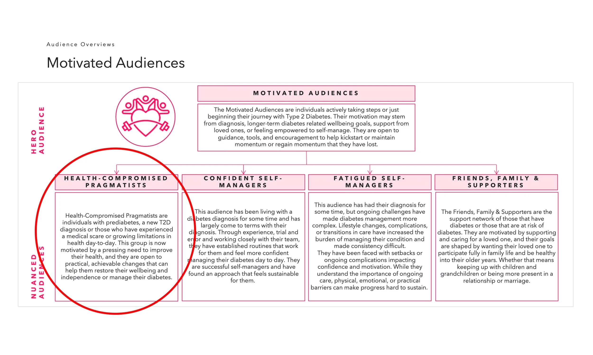
The content team ran social listening to map out who the experience needed to serve, surfacing a group that was newly diagnosed and motivated but lacked a clear place to start. That's who the MVP was built to reach first. My survey and interview program went deeper on that same audience.
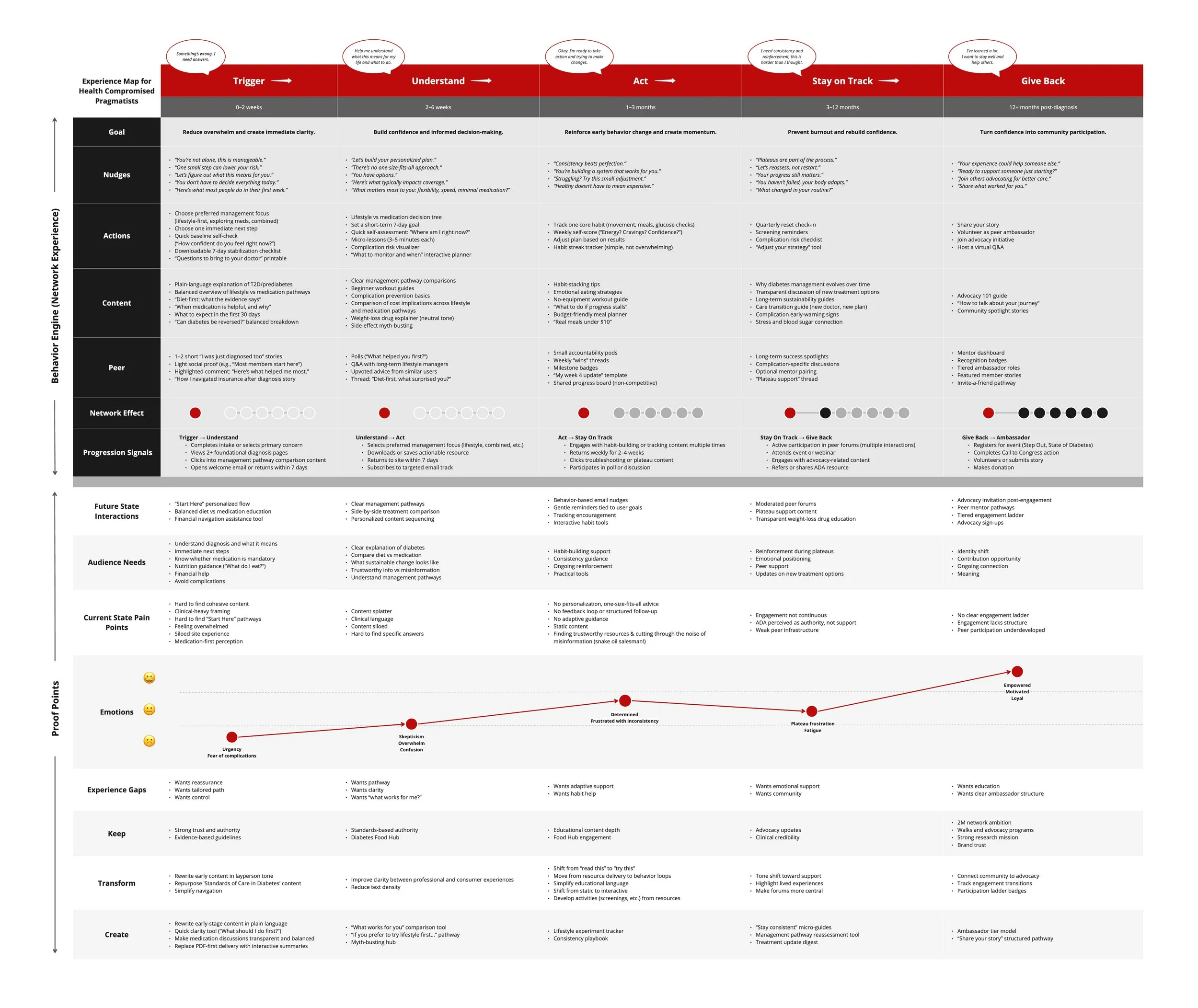
With the audience defined, I mapped their full journey, from first noticing something's wrong to eventually giving back as a peer advocate. Each stage defines specific goals, nudges, and signals for progression. The MVP focused on the first three, Trigger, Understand, and Act, building the foundation people would need before graduating into staying on track and giving back.
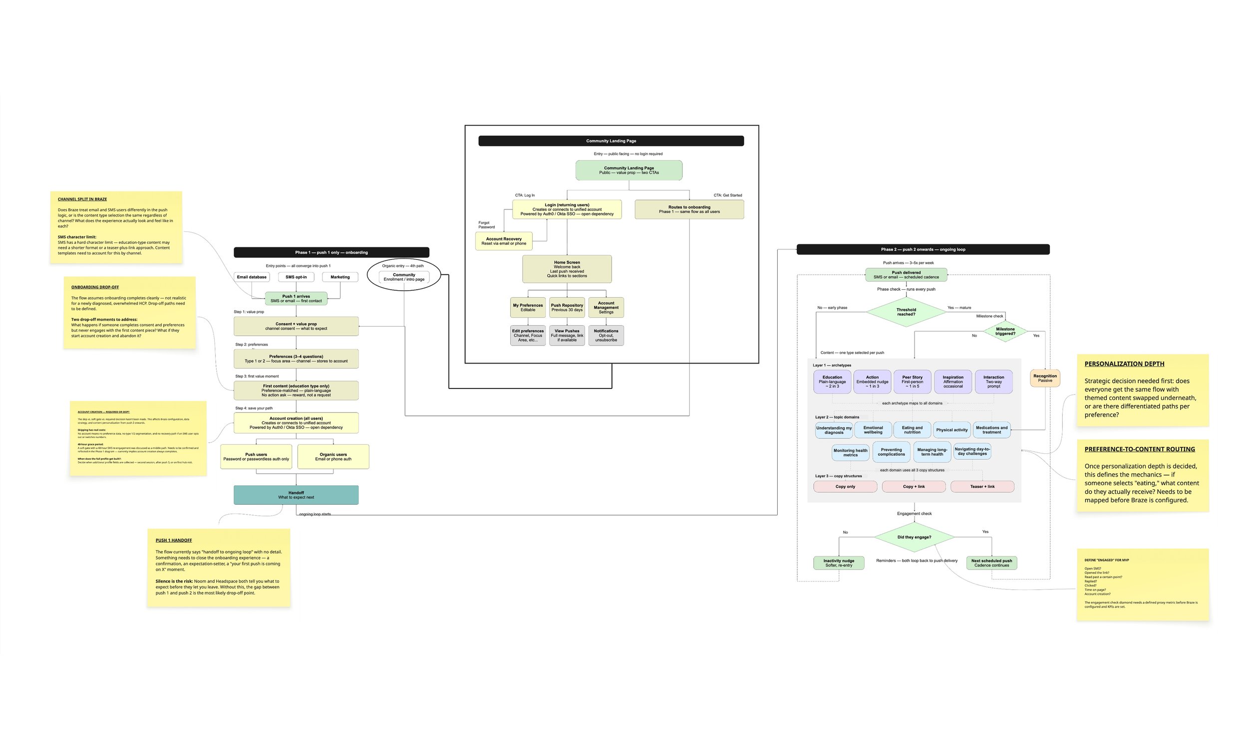
With multiple entry points, content pathways, and personalization layers at play, I used AI to generate a first draft of the user flow, then refined it to show how the primary audience would actually move through the experience. Unresolved questions were flagged directly on the flow, turning open decisions into clear conversation starters for the team.
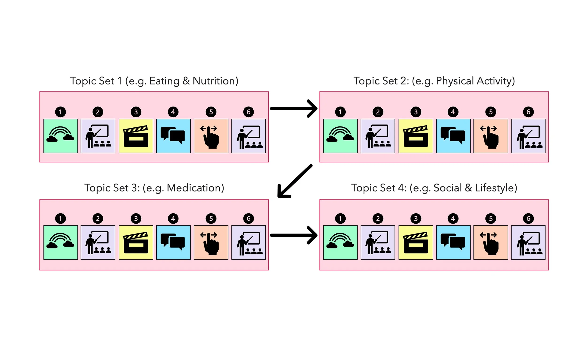
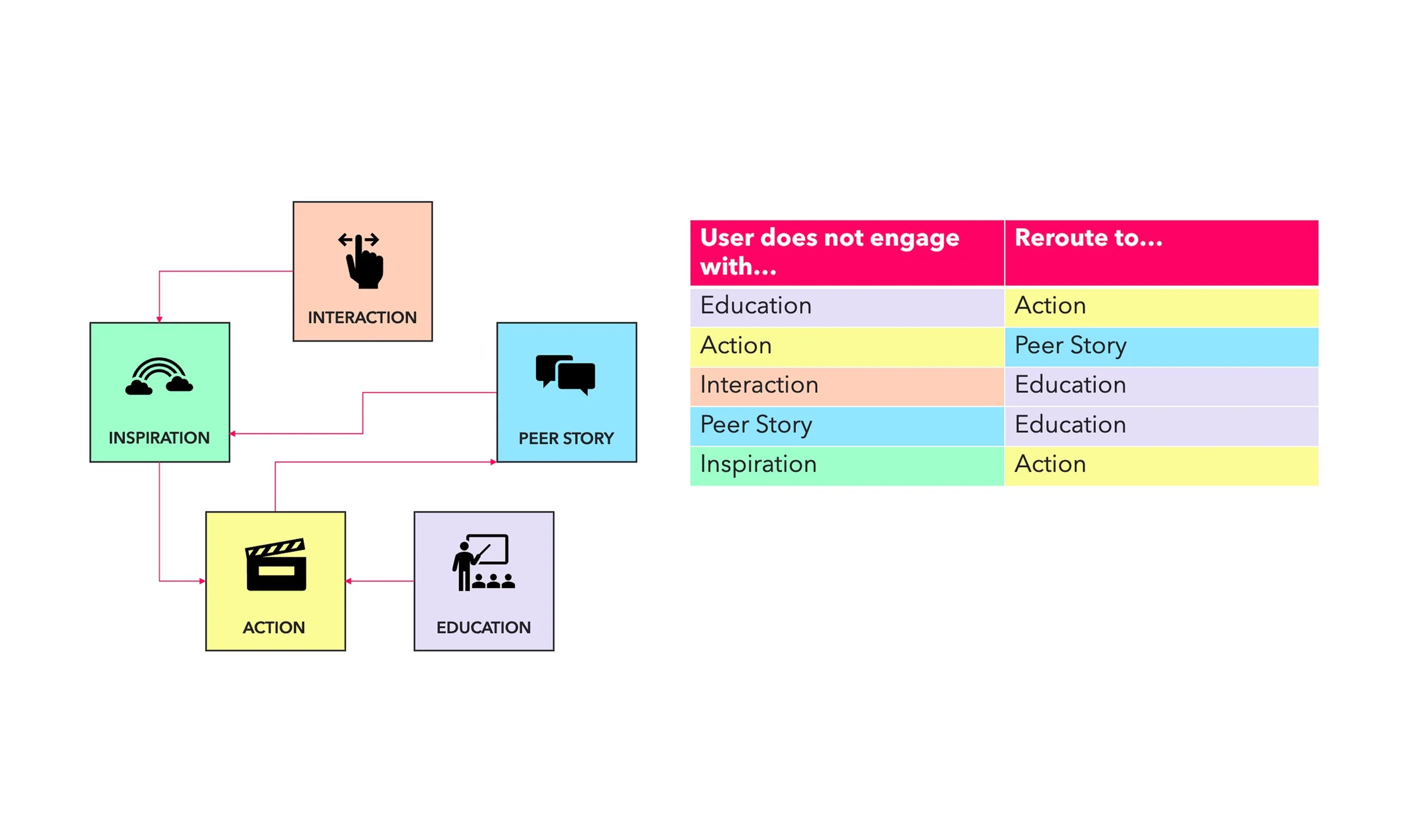
Working with the content team, I helped define how content archetypes, education, action, peer story, inspiration, and interaction, rotate and connect across topic sets. This is where personalization lived: onboarding choices shaped someone's initial path, and if someone disengaged, the system rerouted them to a different archetype rather than repeating what hadn't worked.
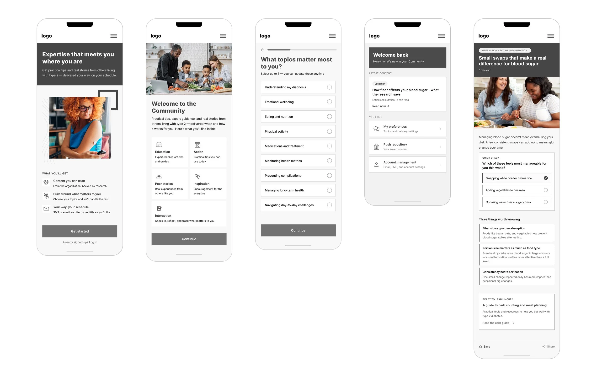
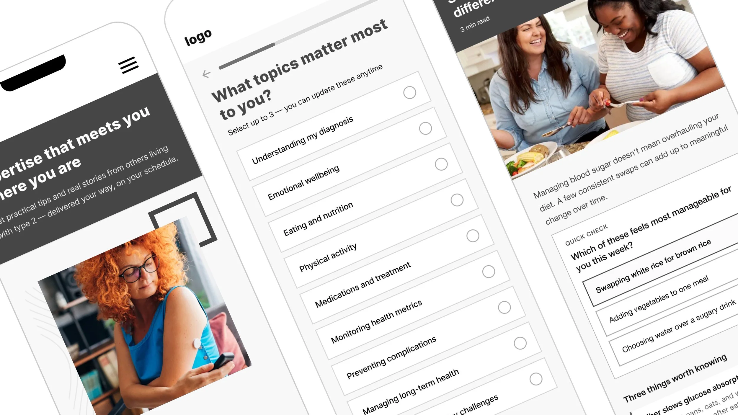
Directional comps, generated with AI, let the organization visualize the experience early without locking into final design too soon. They also served as interview stimuli, testing real response to content, imagery, and tone. Feedback came back positive, with the main ask being more diverse photography and plainer, more relatable language, both of which shaped what shipped.