Uniting 100+ Sites

Snapshot
Client / Bridgestone is the world's largest tire and rubber company, with ~50 production facilities and nearly 55,000 employees across North America, Latin America, and Europe, Serving both B2C and B2B audiences.
Company / iCrossing
Focus / Global B2B & B2C platform unification
Role / Experience Lead, Research
Team / 15 people across design, content strategy, product, and engineering
Timeline / 12 months to launch, plus ongoing enhancement support
Impact / +93% increase in time on site, 30% reduction in post-launch errors
Bridgestone’s digital ecosystem was fragmented, with siloed experiences for commercial, consumer, and corporate audiences.
This lack of integration weakened brand consistency and limited opportunities to cross-sell products and solutions.
Context
Bridgestone's digital footprint had grown into 15+ NA sites, 36+ LATAM sites, 75+ EMEA sites, and 1,000+ separate URLs, each built by a different team with no coordination. Navigation, content, even basic product info varied from site to site. This lack of integration weakened brand consistency and limited opportunities for cross-selling across the business.
Approach
The goal wasn't just consolidation, it was a shift in model: from product-centric, organized around what Bridgestone sold, to customer-in, organized around what audiences actually needed. That meant one platform that could hold both B2B and B2C audiences without watering down either, and scale as new regions and products got added.
We built one reusable component set flexible enough to power dozens of sites consistently, rolled out in phases: starting with Bridgestone and Firestone Commercial, then extending the same framework across Consumer, Motorcycle, Bandag, GCR, LATAM, and EMEA.
Challenge
Design and development had been misaligned before I arrived, and it had already cost the team the client's confidence, part of the job was earning that back. On top of that, B2B and B2C stakeholders cared about different metrics and different wins, so getting to one coherent experience meant getting both rooms to agree on what "better" meant.
I addressed this by implementing an internal and external review and approval process with a predictable cadence and timeline. I also brought developers into the room early, rather than only at approval checkpoints, which rebuilt the client's confidence in how the team operated. For stakeholders, I resolved competing priorities by ranking business units and features by ROI and customer value, giving both rooms a shared, objective basis for what shipped first, with everything else documented for a future state.
Strategy
Turning 100+ fragmented sites into one coherent platform meant building something flexible enough to hold every audience's needs without collapsing into a generic mess. Here's what I prioritized:
Fixed the process, not just the product.
I introduced requirement templates and a creative-specific QA step, the fastest way I knew to close the design/dev gap and rebuild trust with the client.One experience, audience-aware.
Consumer and commercial journeys stayed distinct where it mattered, unified everywhere else.Built for what's next.
The framework supports new regions and product launches without a rebuild every time.
It’s not just about building sites more efficiently, it’s about delivering a seamless, trustworthy experience everywhere Bridgestone shows up.
Ownership
As Experience Lead, I directed a team of three designers alongside content strategy, product, and engineering, staying close to research and wireframing. My work included:
Unblocked the team.
Turned stakeholder feedback into clear direction the team could actually act on, and cleared blockers when they came up.Synthesized at scale.
Took feedback from a wide stakeholder group and turned it into one clear, consistent design direction.Aligned design and engineering.
Ran development refinement sessions to keep design and engineering aligned on what was actually feasible.Bridged the data.
Partnered directly with our analytics partner, translating real data into design decisions across the team.Owned the client relationship.
Presented solutions directly to external stakeholders and managed their expectations.
Impact
Here's what changed, in numbers:
Efficiency: 69% reduction in YoY cost per site, with 85% pattern reuse across the platform.
Engagement: +93% increase in time on site; +71% increase in PLP views, +27% in PDP views.
Cleanup: 470 pages and assets removed; 30% reduction in post-launch errors, thanks to the creative-specific QA process.
It's infrastructure that scales for new regions and new products without starting over.
Reflection
Caught a gap in how developers were involved.
Early on, only tech leads sat in on refinement sessions, not the developers actually doing the work. That gap is what pushed me to bring developers into sessions directly, once they could react to real screens and flag constraints on the spot, our estimates got noticeably more accurate.Set expectations with stakeholders early, not during review.
One stakeholder team came in wanting something that technical limitations wouldn't allow, and we didn't find that out until we were mid-design-session. It derailed the agenda and cost us time. Naming constraints upfront, before the meeting, would've kept things on track.
Discovery Process

Audited ~100 NA, LATAM, EMEA sites. Pinpointing global functionality and component gaps, prioritizing reusable and adaptable elements to support a scalable, consistent experience across regions and audiences. Tagged all components as Reuse, Adapt, or Invent.
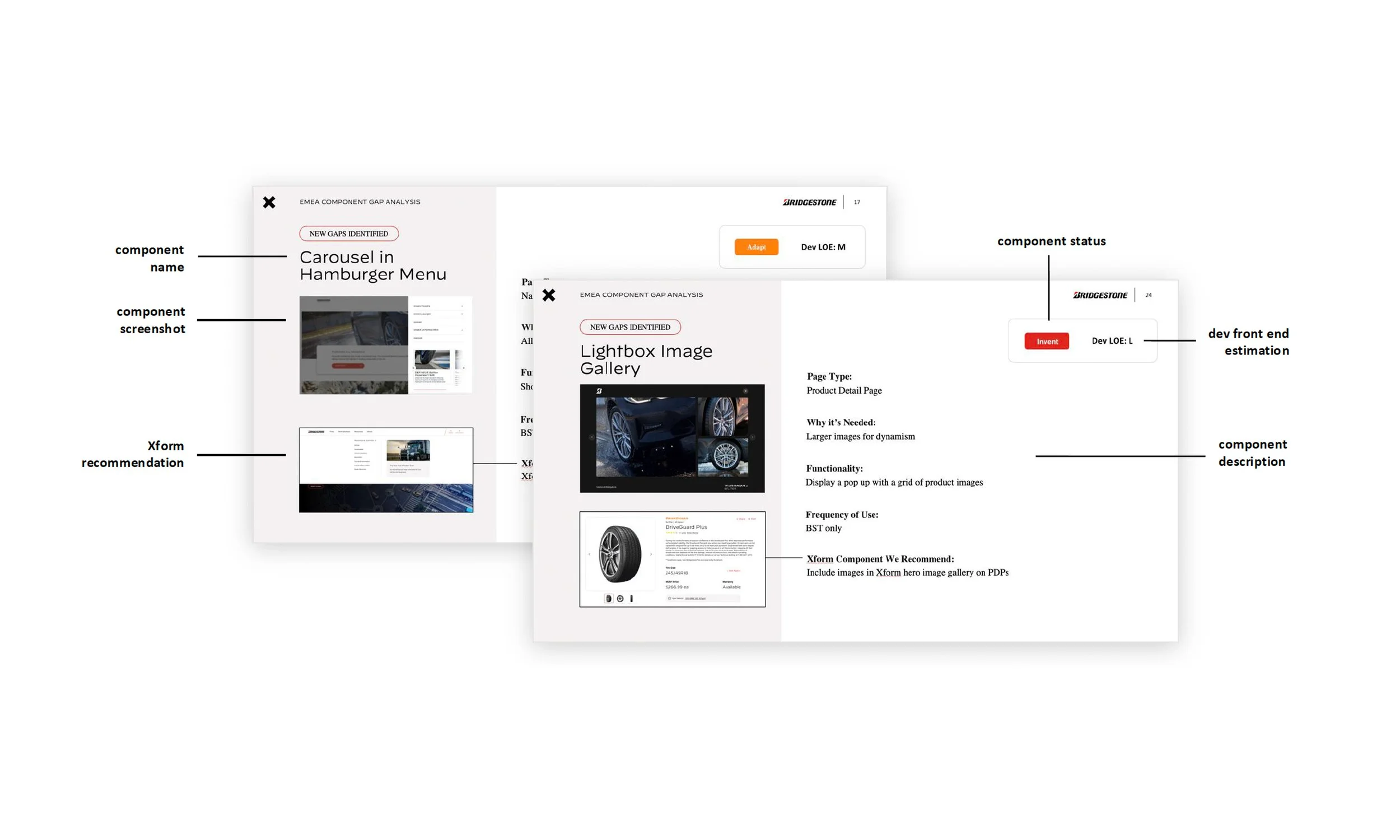
The Gap analysis showed only 10% of components required net new development. Most new features addressed regional needs, such as WhatsApp integration, and product card regulatory considerations.
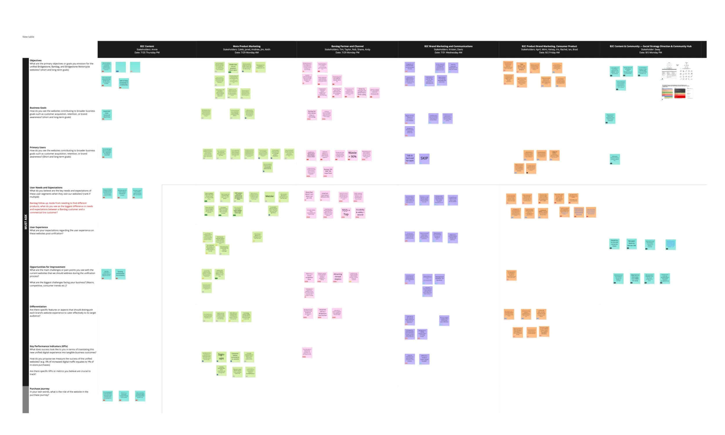
Interviewed 23 stakeholders across nine B2B and B2C groups, uncovering diverse user needs and business priorities. Findings emphasized the importance of a customer-focused approach, highlighting dealers as a key audience and motorcycle buyers as enthusiast-driven users.

Developed personas using existing data, social listening, user insights, and stakeholder interviews to inform audience-focused design decisions across B2B and B2C users

Users prioritize data and education, value technological advancements, cultivate customer relationships, and rely on brand reputation for trust.
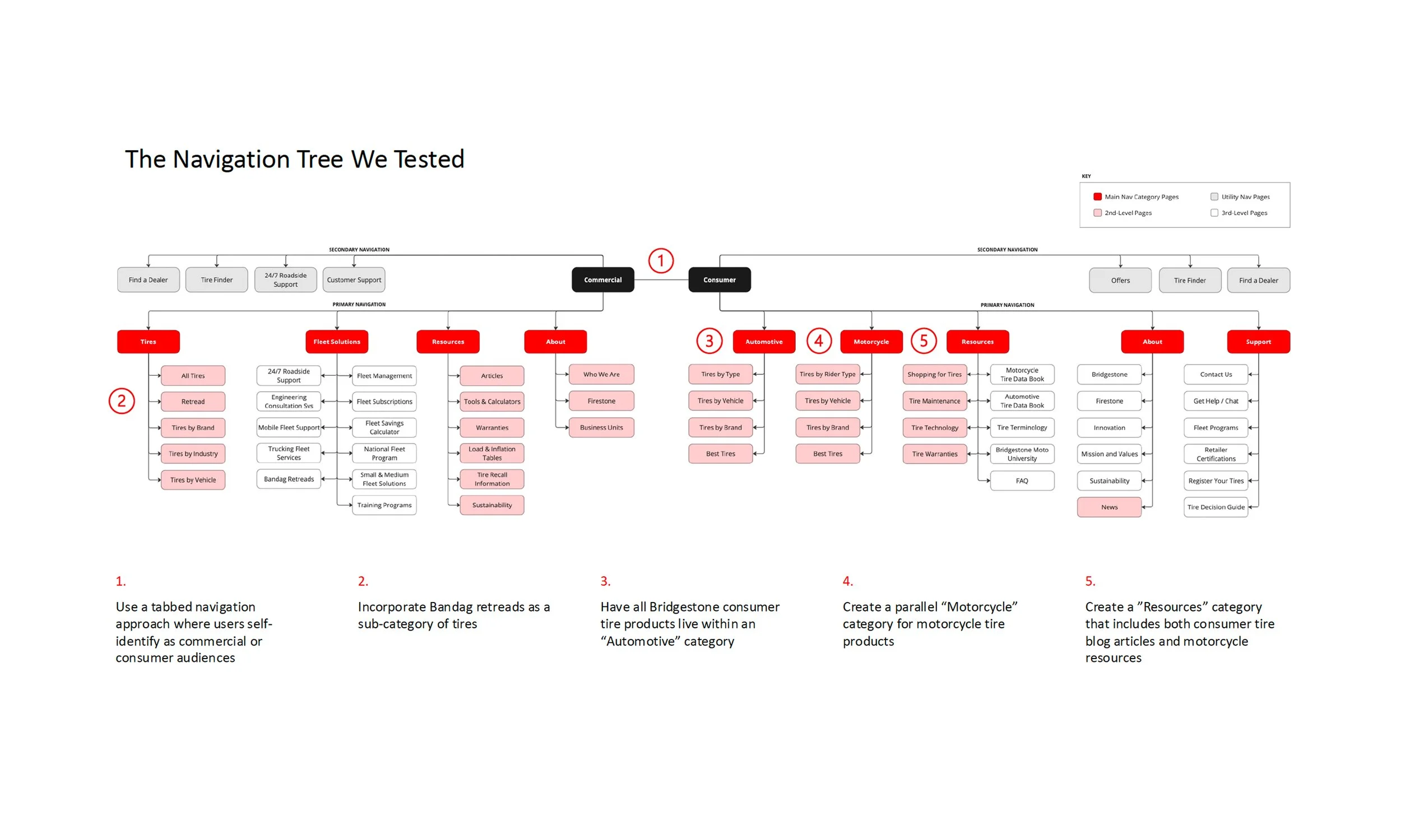
Conducted tree testing with 105 participants to validate navigation and simplify the unified site experience across commercial, automotive, and motorcycle audiences.
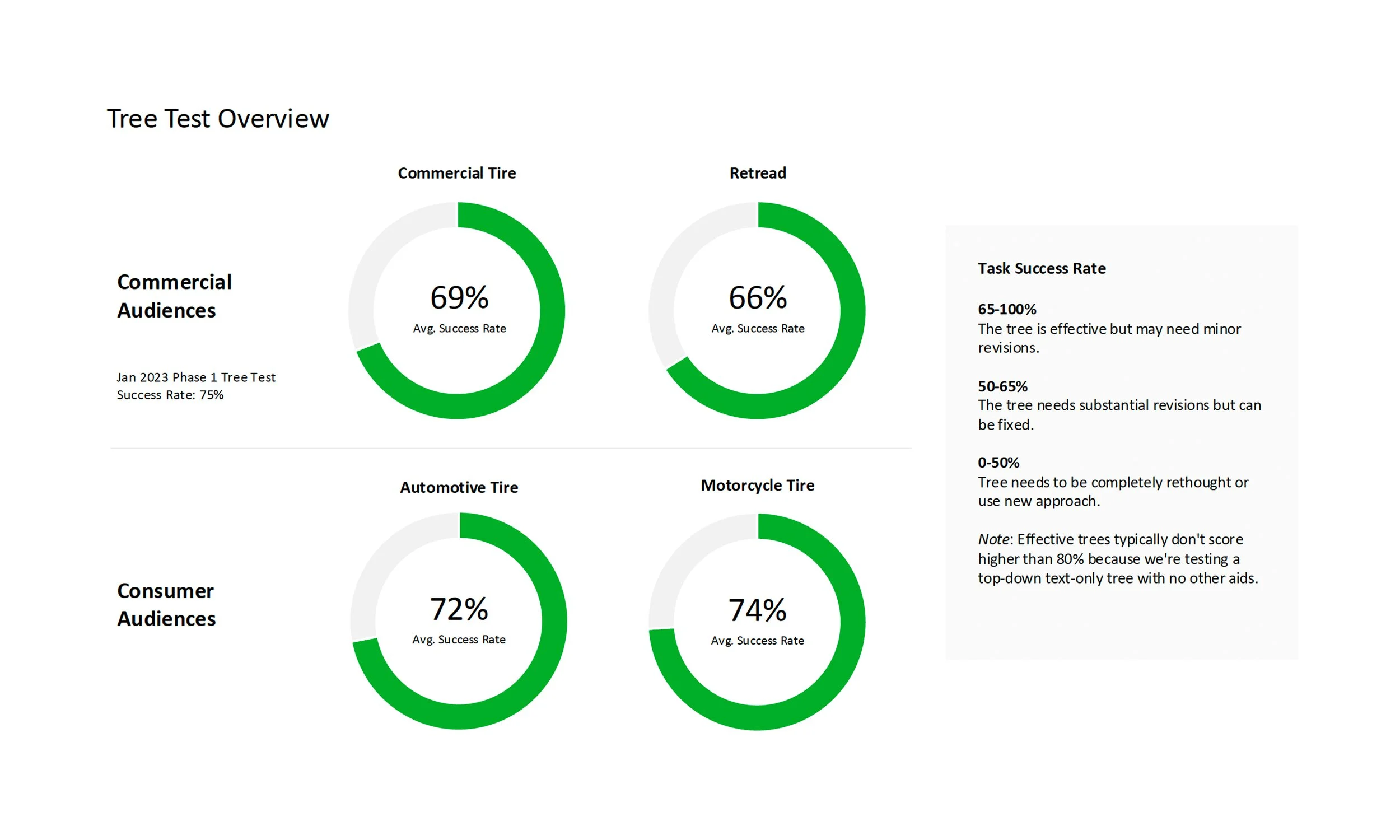
Overall task success was strong, with consumers performing slightly better. Key opportunities include clarifying educational tool segmentation and improving cross-linking to boost searchability.
Designs
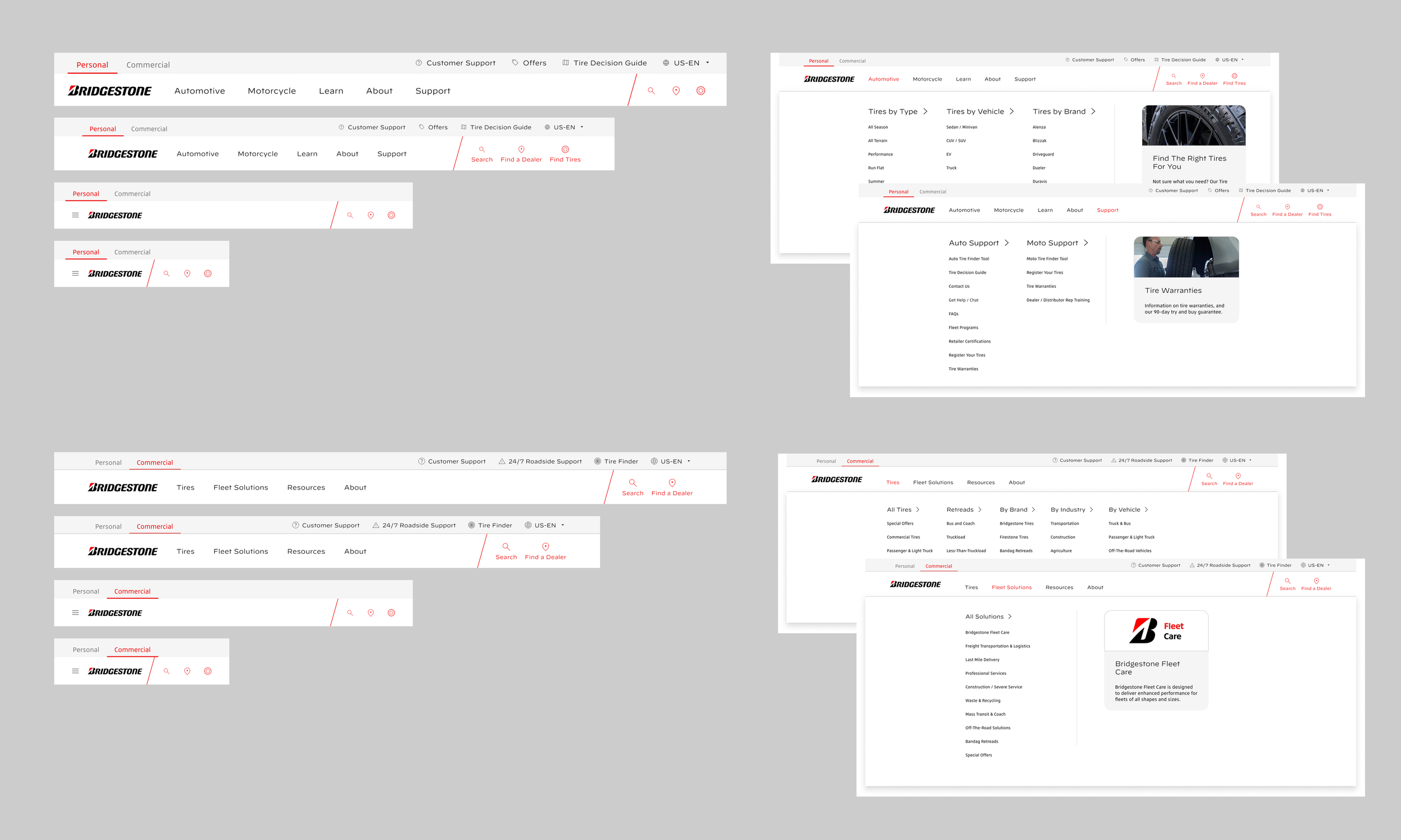
As part of consolidation, the unified site delivers a seamless shopping experience, allowing customers to easily switch between Consumer and Commercial products and solutions.

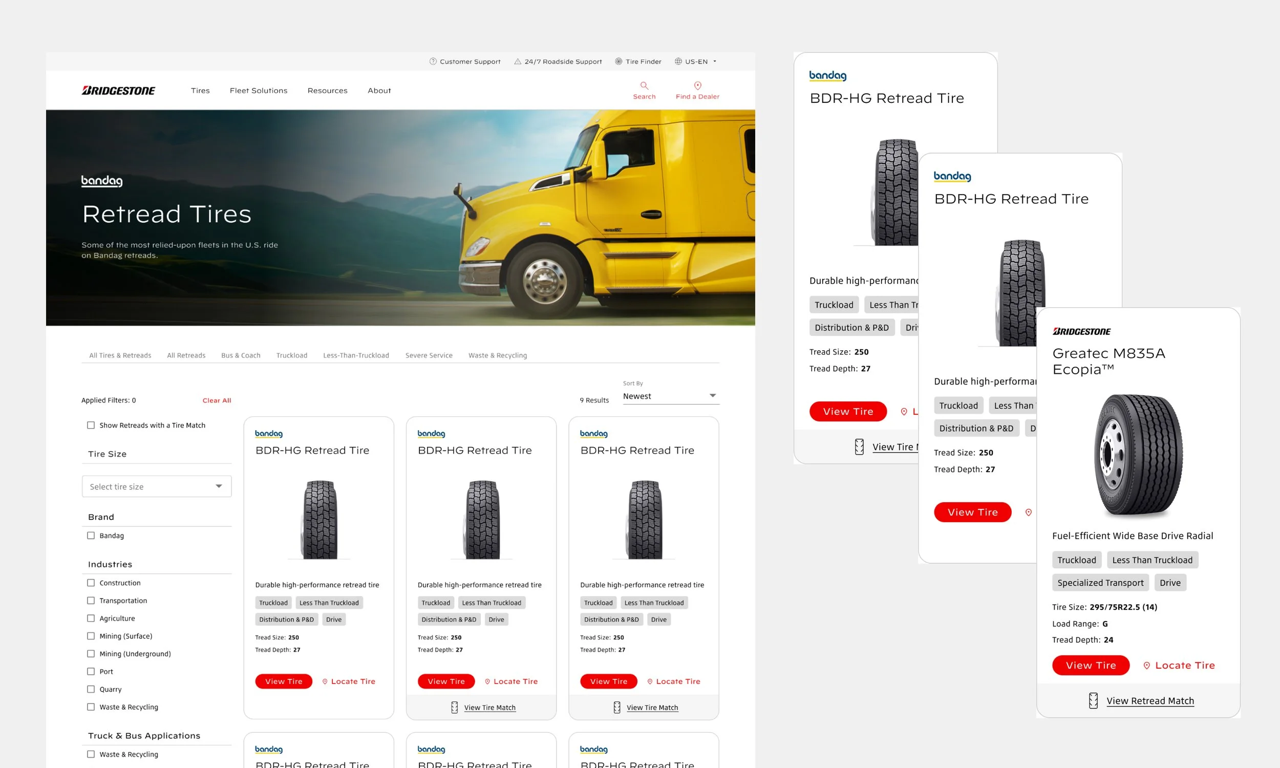
Commercial PLP
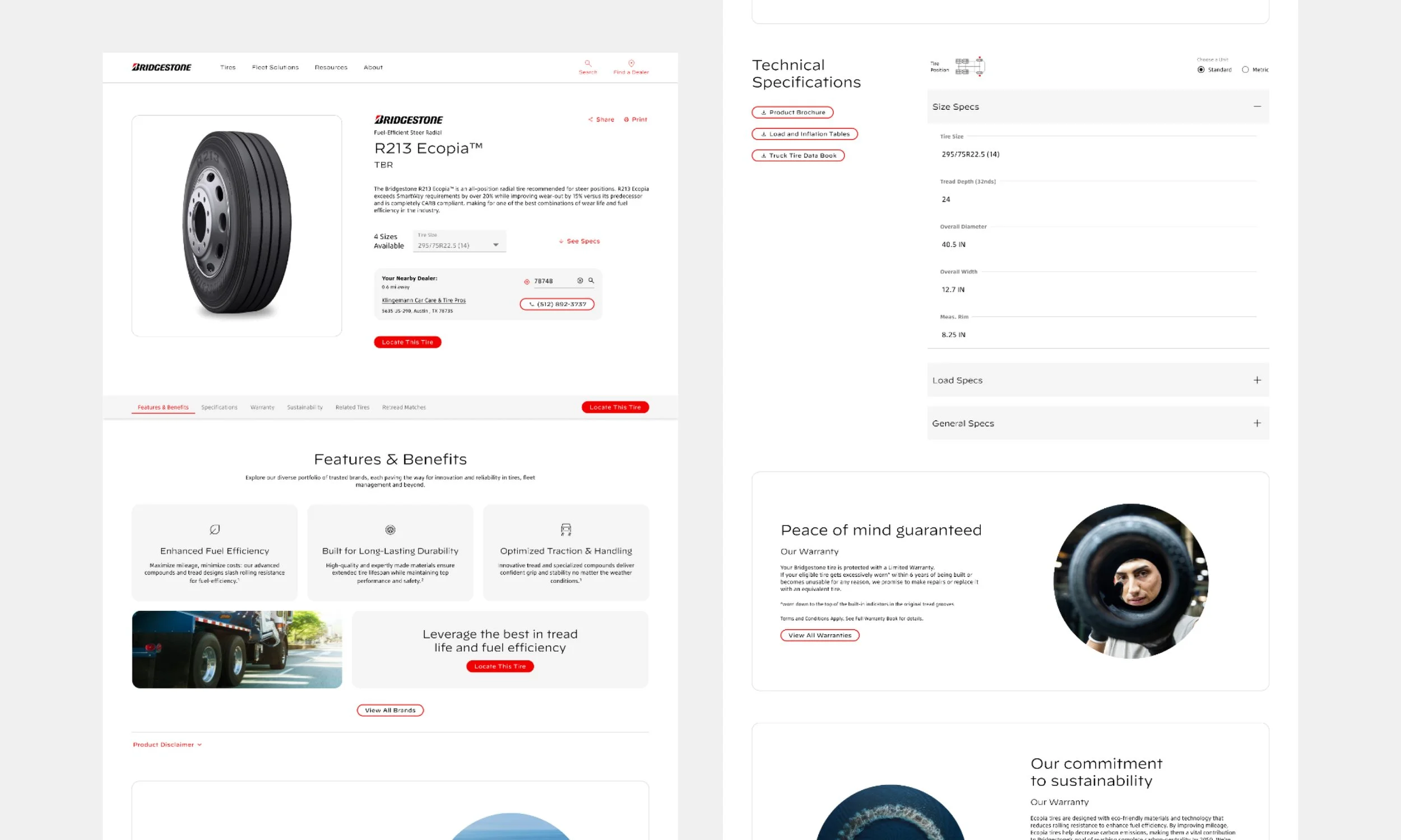
Commercial PDP
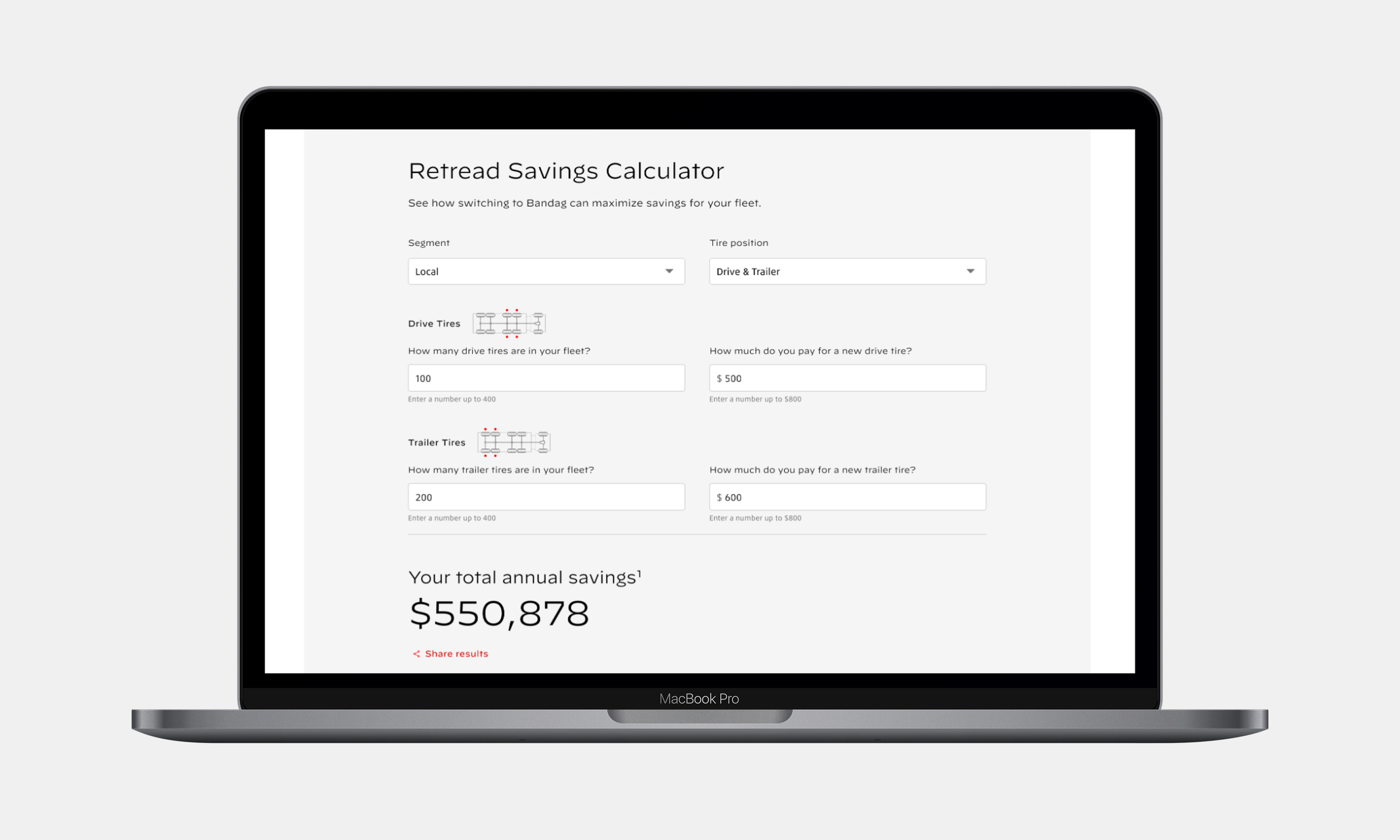
Commercial Retread Savings Calculator
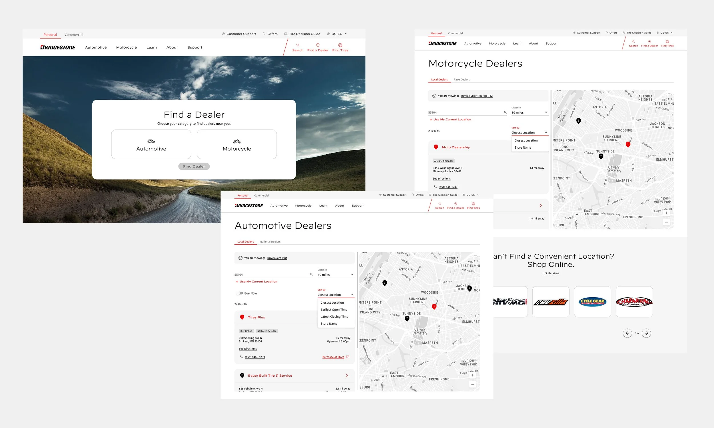
Consumer Dealer Search with self-selection for Automotive or Motorcycle results
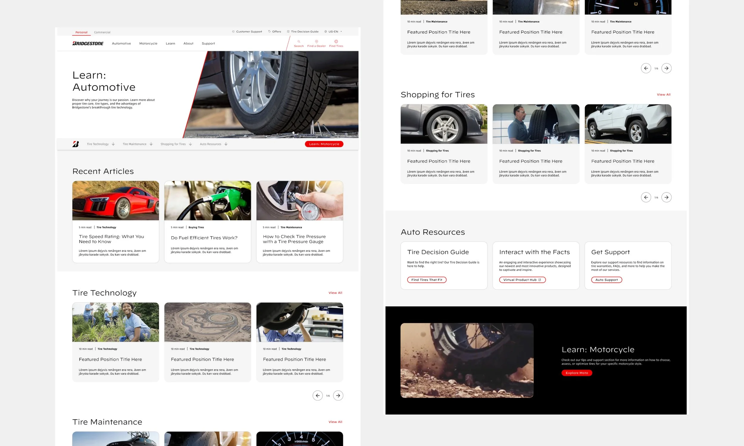
Consumer Resource Center
Testing
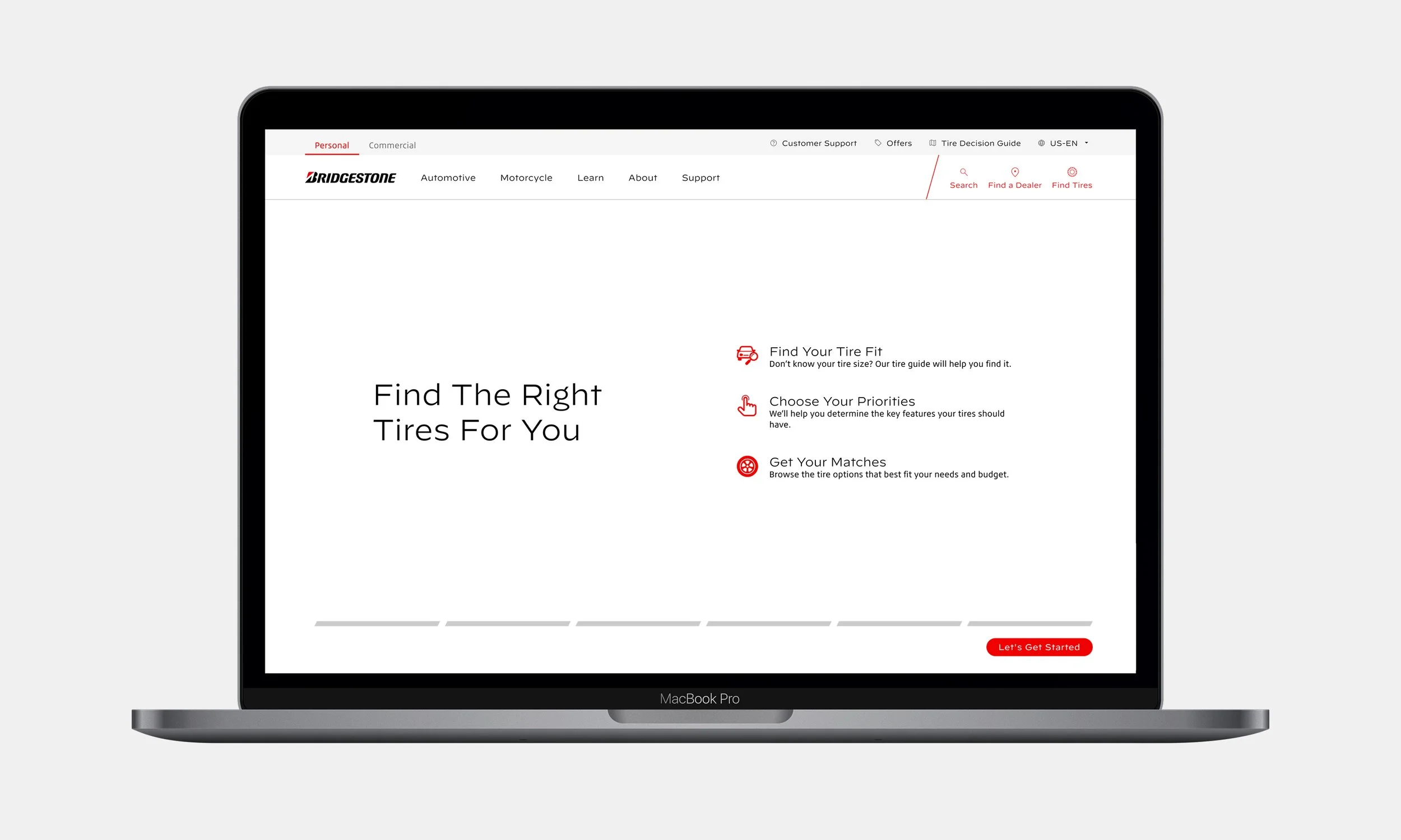
The Tire Decision Guide is a shopping tool that helps consumers, especially those less familiar with tire purchasing, find curated tire matches by entering personalized vehicle details, converting prospects into customers.
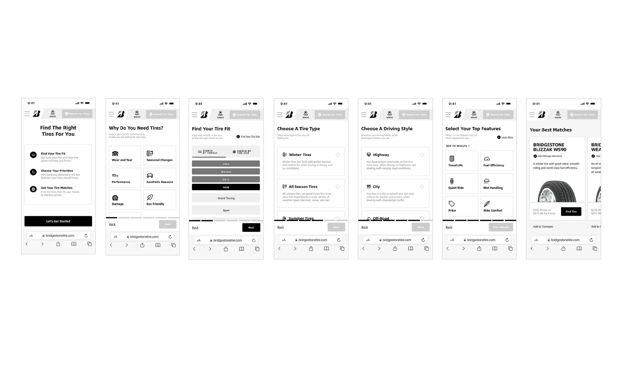
Conducted unmoderated usability testing to evaluate process intuitiveness, clarity of next steps, and usefulness of match results for supporting purchase decisions.

Tool received a 4.8/5 helpfulness rating, with 80% of users finding all steps clear; minor improvements were suggested, including clarifying the “Why Do You Need Tires” step and adding VIN/license plate lookup in the future.

Essential UX improvements were implemented and documented, while lower-priority enhancements were backlogged for future phases.