One Platform, Three Clinical Audiences
Snapshot
Client / Fresenius Kabi USA provides medicines, clinical nutrition, and medical technologies for infusion, transfusion, and hospital care. Part of a global network with 85 state-of-the-art manufacturing plants and R&D centers, the company builds on more than 100 years of experience supplying healthcare providers with essential, life-saving therapies.
Company / Multiple, Inc
Focus / Digital Platform Redesign
Role / Experience and Design Lead
Team / 4 people split across design and engineering
Timeline / 6 months to launch
Impact / +114% total sessions, +784% search traffic, +246% referral traffic
The redesign needed to move Simplist from one generic message to a site that spoke to pharmacists, nurses, and anesthesiologists on their own terms.
Context
Simplist® is a prefilled syringe that comes ready to use, no prep or measuring required, which cuts down on dosing errors. But the website wasn't reaching the clinicians it was built for.
The safety and value messaging got lost, and the site itself was hard to use, so people couldn't find what they needed when it mattered.
Approach
Simplist needed to speak to three different clinical audiences, pharmacists, nurses, and anesthesiologists, each with their own priorities, without turning into three separate, disconnected experiences. The approach was one platform with paths built for each audience.
Content and pathways were built around those real differences, with safety and clinical credibility leading every message ahead of any marketing angle. The site launched in phases as Simplist's product portfolio grew, so new syringes and audiences could be added without rebuilding the platform each time.
"How do you make my job easier?"
Every audience was really asking some version of this question and each one needed a different answer: less risk for pharmacy, less prep for nursing, more speed for anesthesia.
Challenge
This is a heavily regulated space. Every piece of content and every design decision had to clear legal and clinical review, and whatever we wanted to say from a marketing standpoint still had to hold up clinically. Getting the balance wrong risked trust either way.
That created a real tension: safety and usage info needed to be quick and easy to grasp in the moment, but couldn't lose the precision that made it accurate and legally sound. Too simple, and someone could misuse the product. Too dense, and no one reads it when they actually need it.
I addressed this by running messaging workshops with the client team to pressure-test tone and clarity, and looping in the review team early rather than waiting until content was finished, so compliance issues surfaced while there was still room to adjust.
Strategy
Getting to the right design meant starting with the people using it. I ran stakeholder interviews and workshops with pharmacy, nursing, and anesthesia to understand what each group actually needed, then presented multiple approaches rather than settling on one direction, testing with clinicians and stakeholders along the way. Here's what came out of it:
Built around the audience.
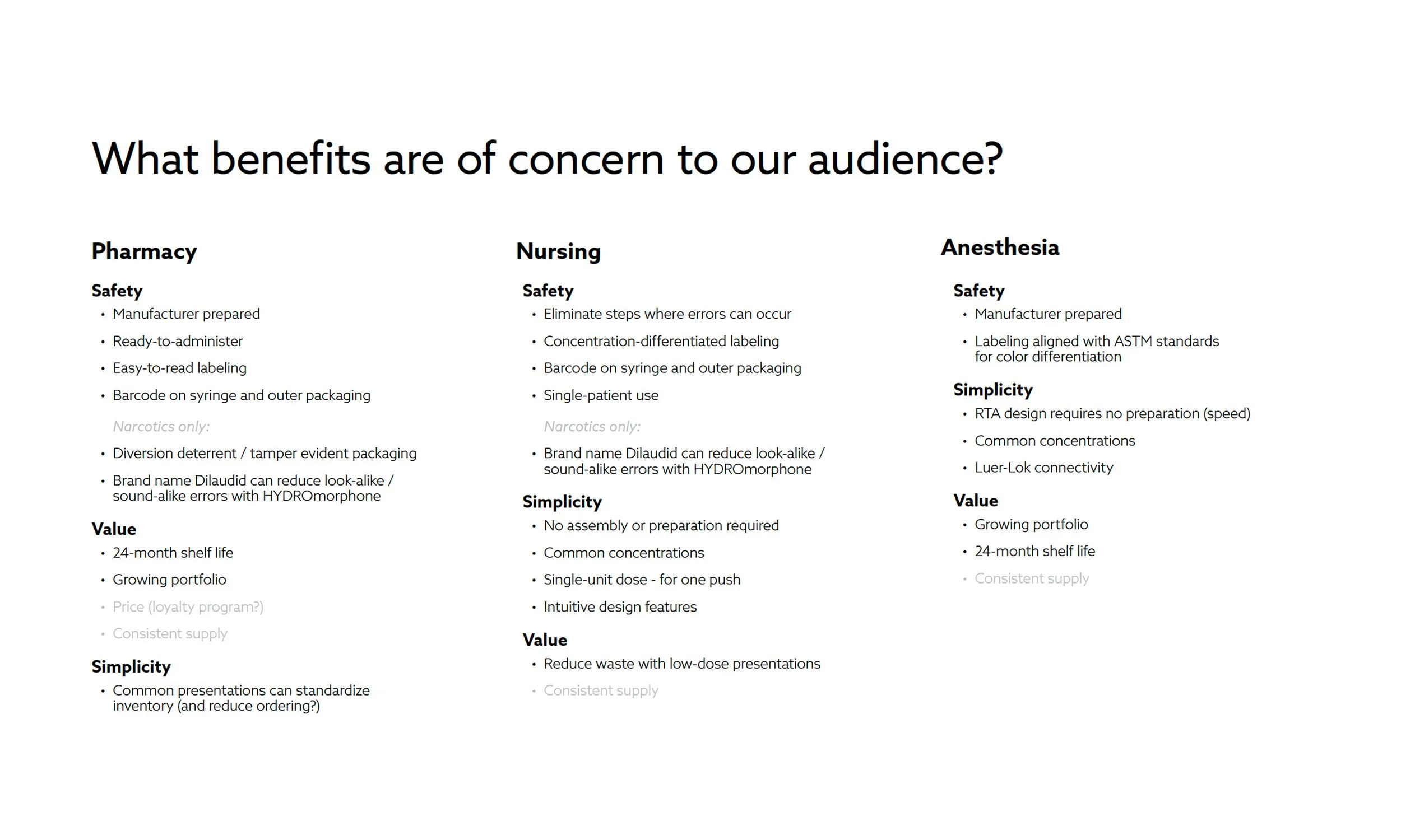
Pharmacy focused on diversion deterrence and inventory standardization; nursing cared about eliminating prep steps and reducing waste; anesthesia needed speed and consistent dosing in the OR. I structured content and pathways around those real differences, not a one-size-fits-all message.Led with safety.
Positioned Simplist® around safety, simplicity, and confidence in medication delivery, ahead of any marketing angle.
Ownership
As Experience and Design Lead, I directed one designer while working closely with engineering and clinical stakeholders, owning the process from end to end. My work included:
Led research and discovery.
Ran stakeholder workshops and interviews across pharmacy, nursing, and anesthesia, and managed weekly legal review sessions to keep the project moving without sacrificing compliance.Designed inside real constraints.
Built detailed designs that worked within strict regulatory requirements.Kept everyone aligned.
Kept design, content, legal, and client stakeholders on the same page throughout.Made the complex clear.
Took dense medical and product information and turned it into something clinicians could actually use.
Impact
The original site was hard to find, harder to search, and rarely used once people got there, which is why these numbers moved as much as they did:
Traffic: +114% total sessions, +246% referral traffic
Search: +784% search traffic
Engagement: +23% average session time
Success wasn't just traffic, it meant more clinicians finding clear, trustworthy information at the exact moment they needed to make a call about patient care.
Reflection
Tighter review cycles with the client.
The client wanted to keep revisiting concepts and content indefinitely. We eventually held firm on deadlines and a set number of review sessions, but setting that structure at kickoff, rather than after things started slipping, would have saved real time.ISI requirements upfront.
The first Important Safety Information (ISI) design got rejected, and the compliant version ended up taking up most of the screen, especially on mobile. Nailing down those requirements before design started would have opened up more room to find something that worked for both users and legal.Tighter coordination with launch timing.
New syringes kept coming to market and pushing back launch timing. Being more strategic about which products launched first, and when, would have made the site more valuable from day one instead of playing catch-up.
Discovery Process & Design
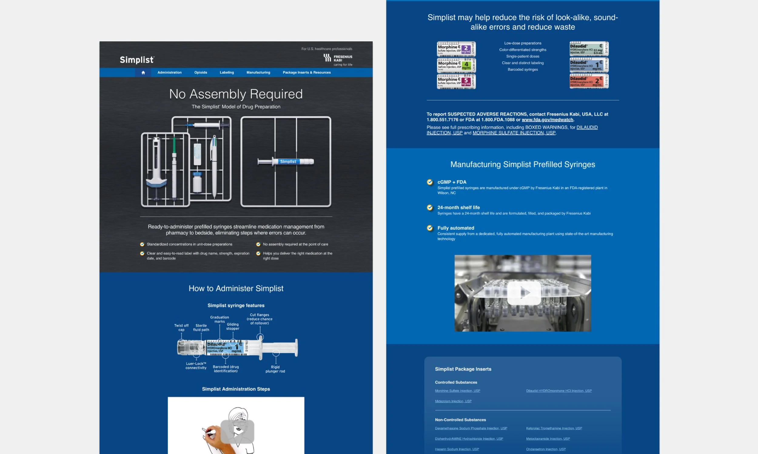
The legacy site lacked clear, audience-specific messaging and failed to provide sufficient product, safety, and regulatory information, making it difficult for clinical users to find what they needed. It also underrepresented the brand’s expertise and offered fragmented resources, limiting trust and overall usability.
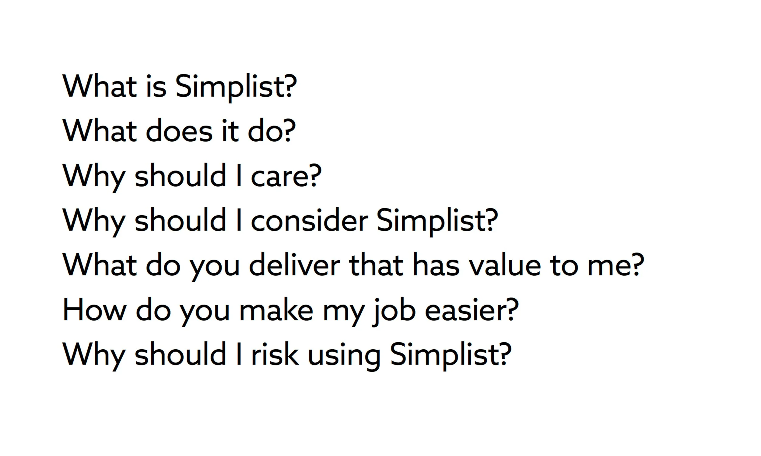
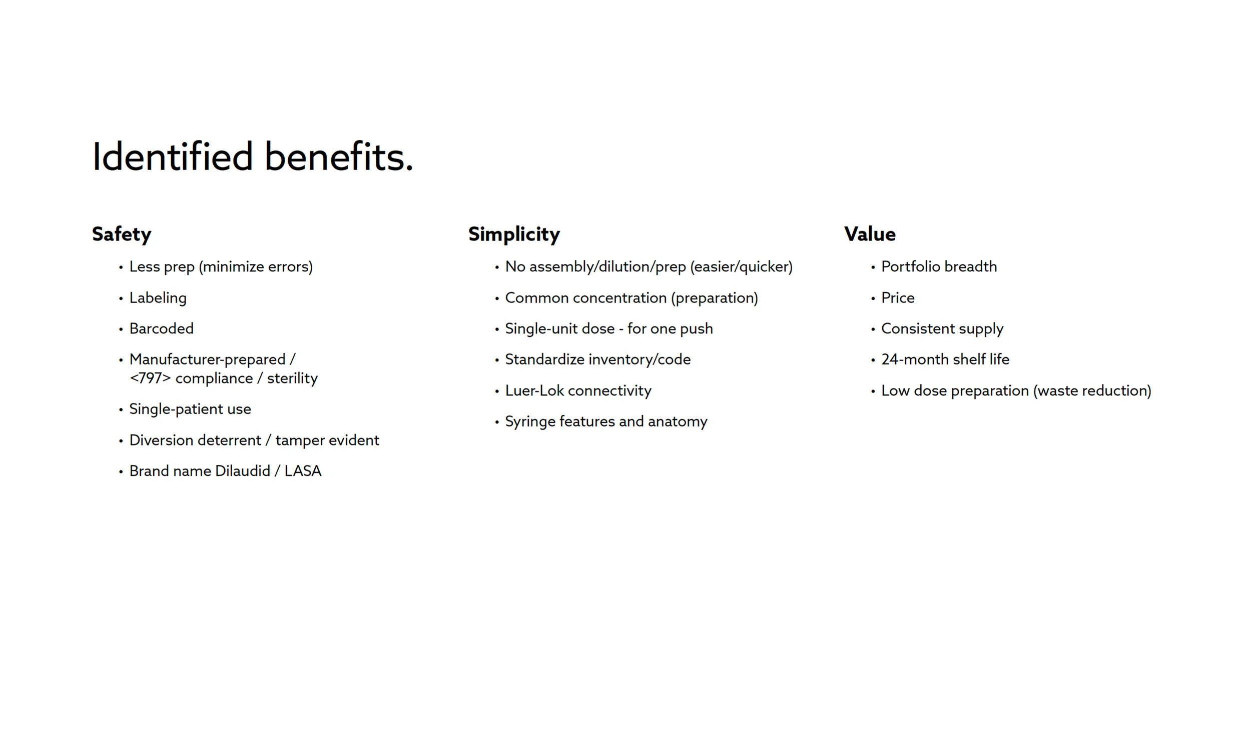
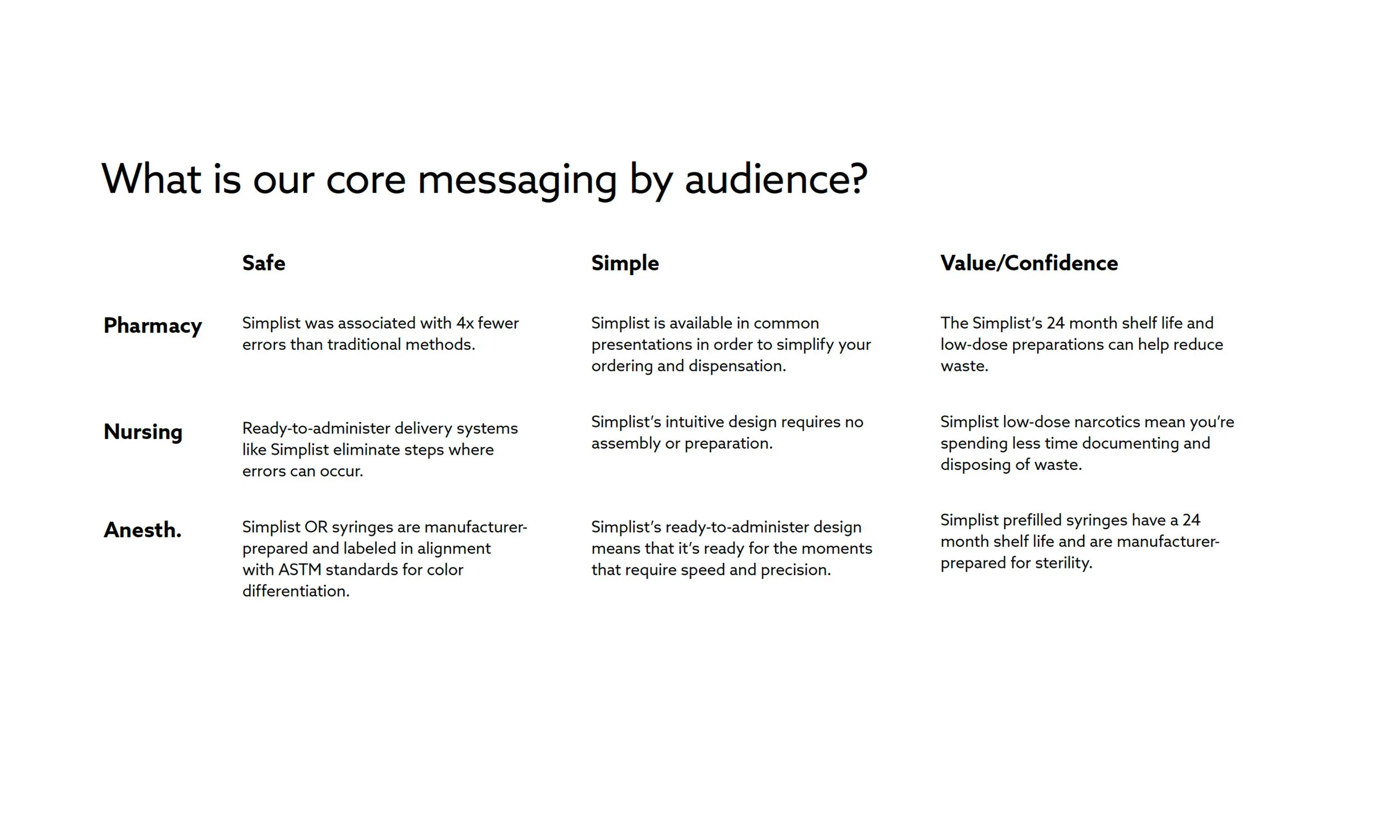
I mapped the questions each audience was really asking, then built a Safety/Simplicity/Value framework tailored to each role, pharmacy, nursing, and anesthesia each needed different proof points to answer the same underlying question: how do you make my job easier?
Visual direction
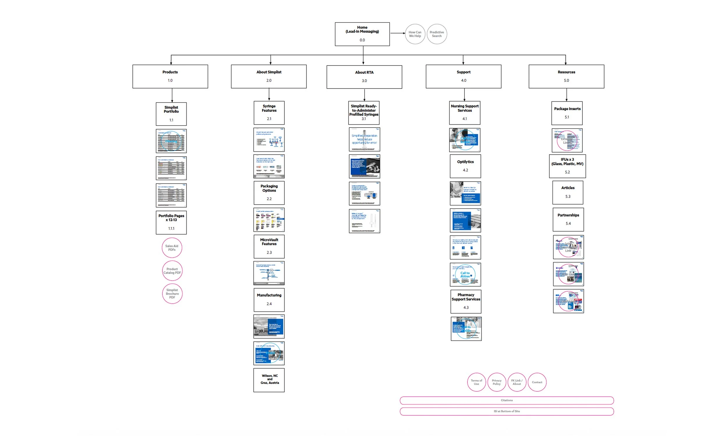
Visual sitemap
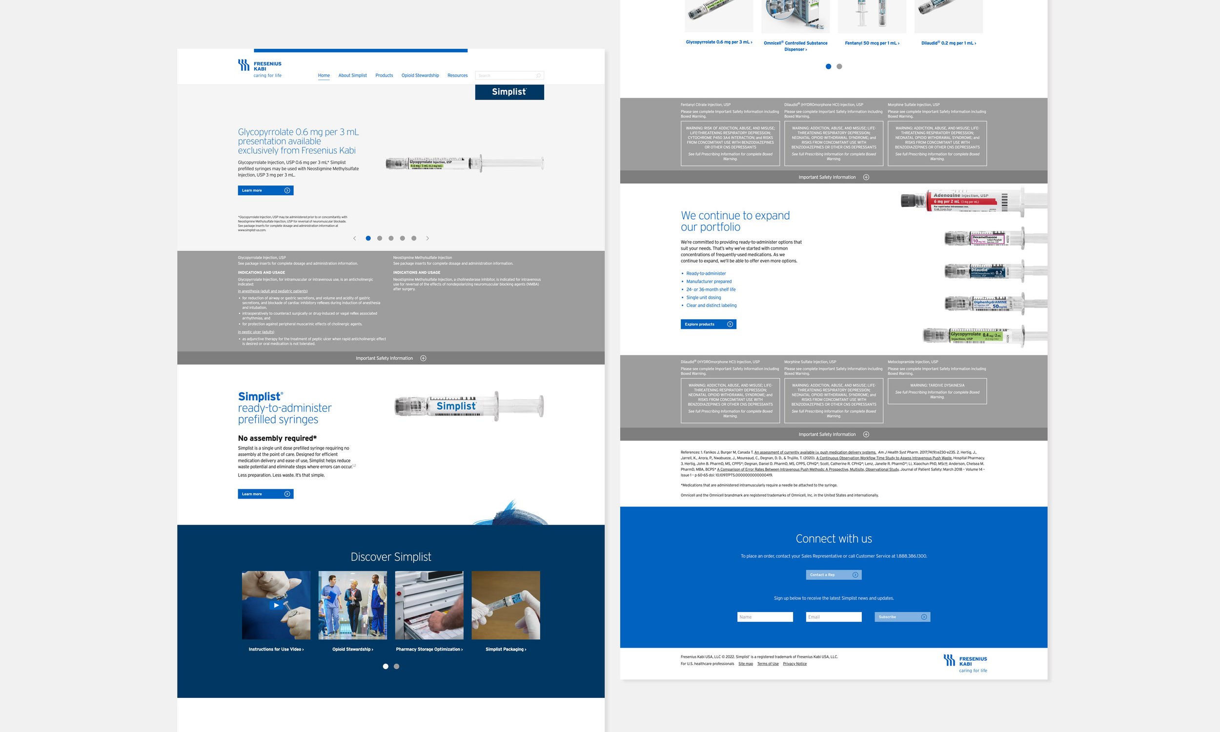
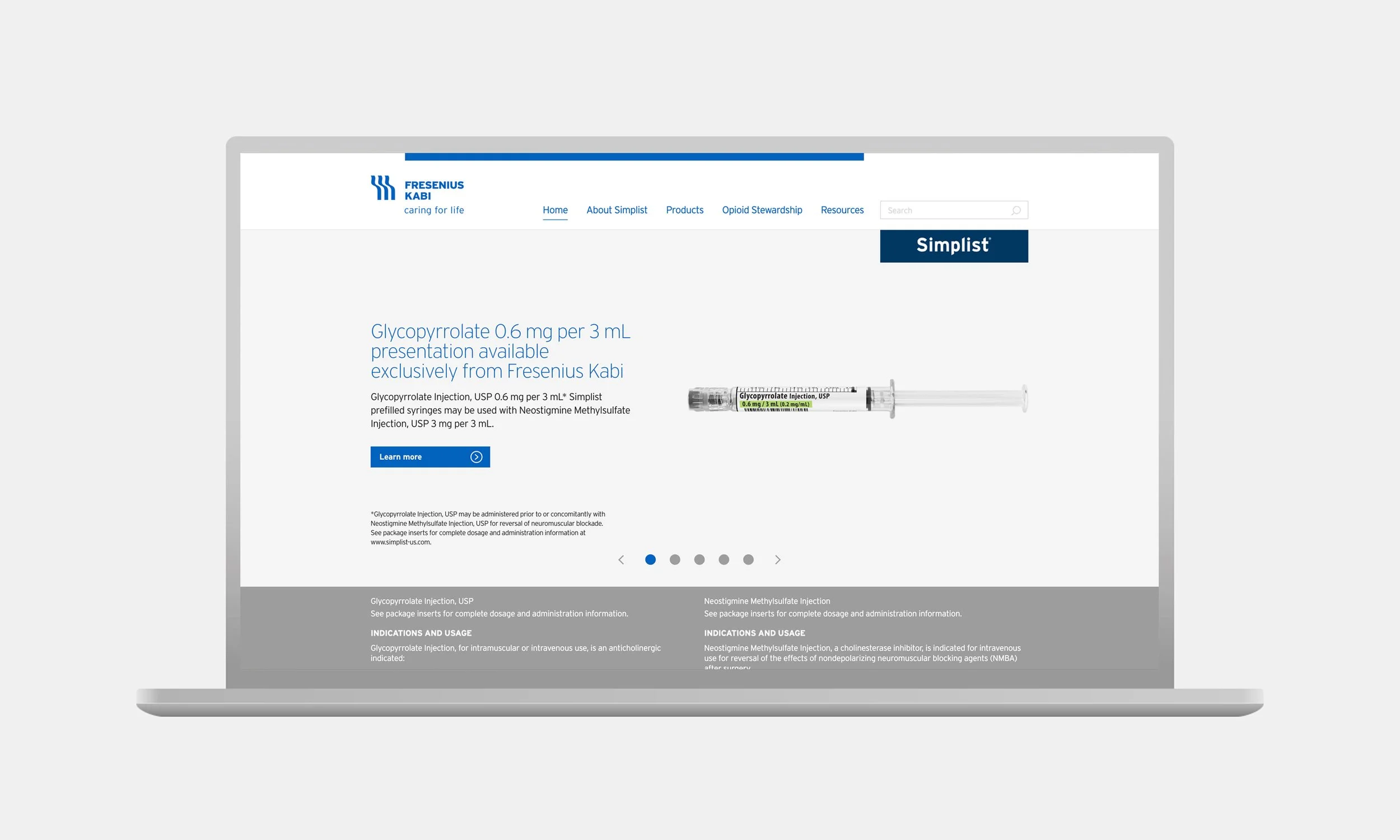
Homepage updated to feature Important Safety Information (ISI) prominently within the product line of sight.
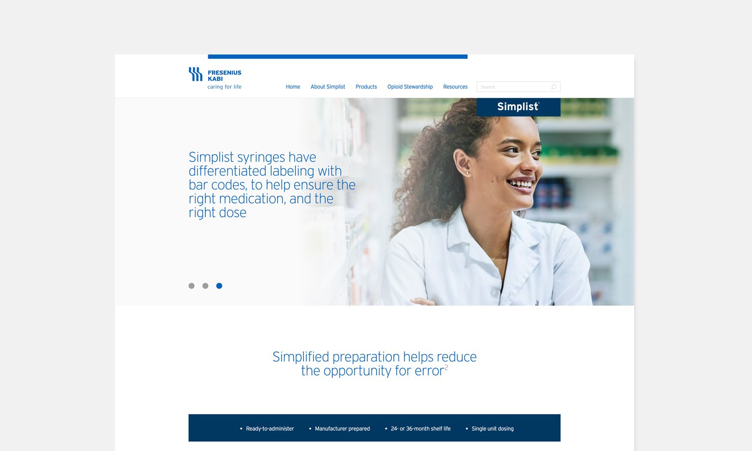
Audience specific content
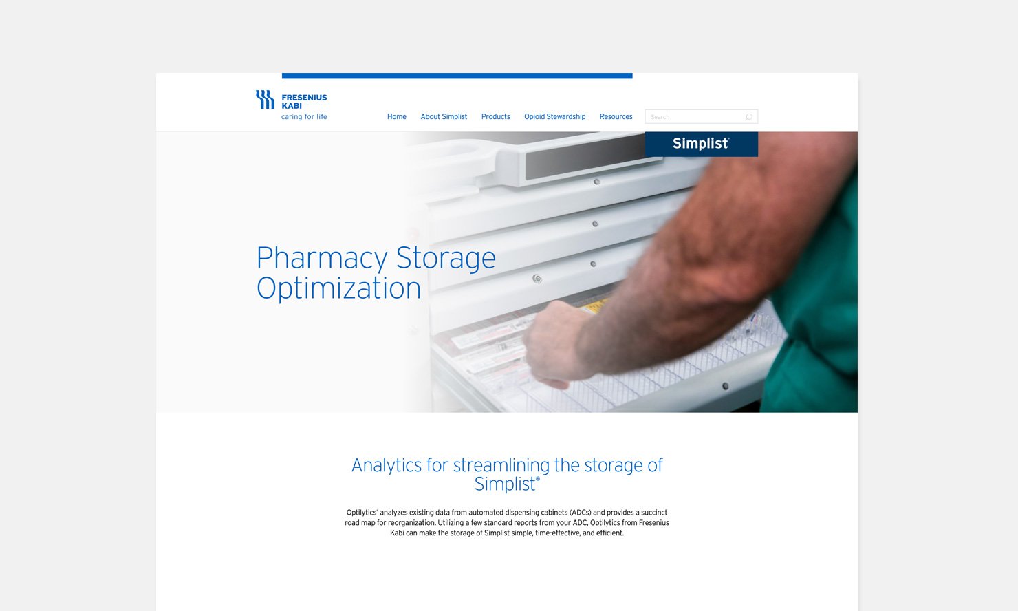
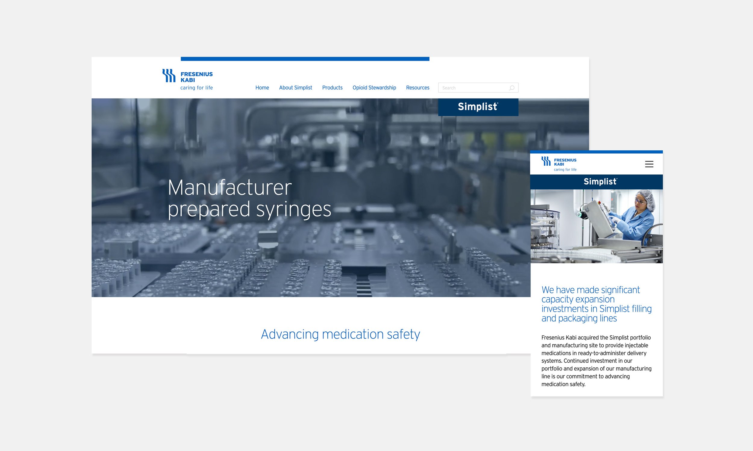
About pages
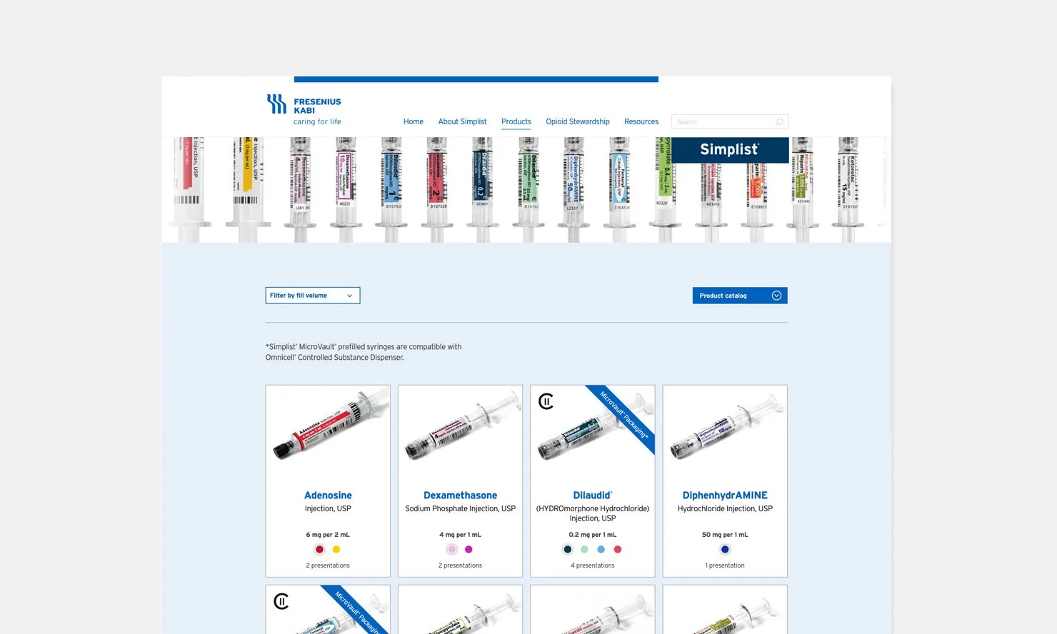
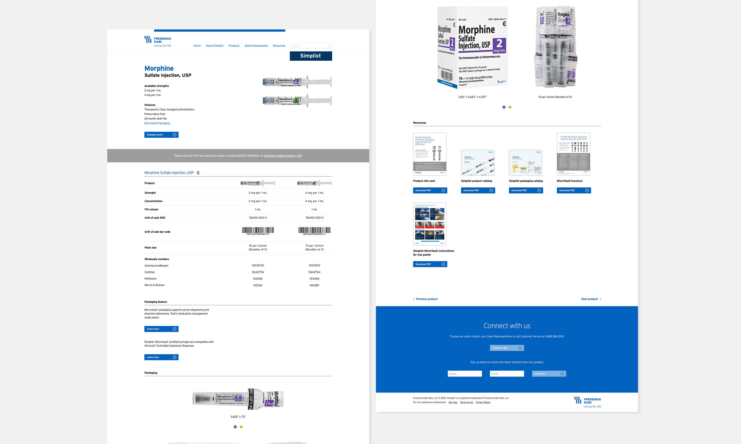
Product portfolio PLP and PDP